Moving along with development of the Sarobag, we wanted to get a marketing storyboard ready for our clients in order to showcase our idea and the brand we are developing. With other designers working on the general bag styling and construction, our graphic artist started on the logo design.
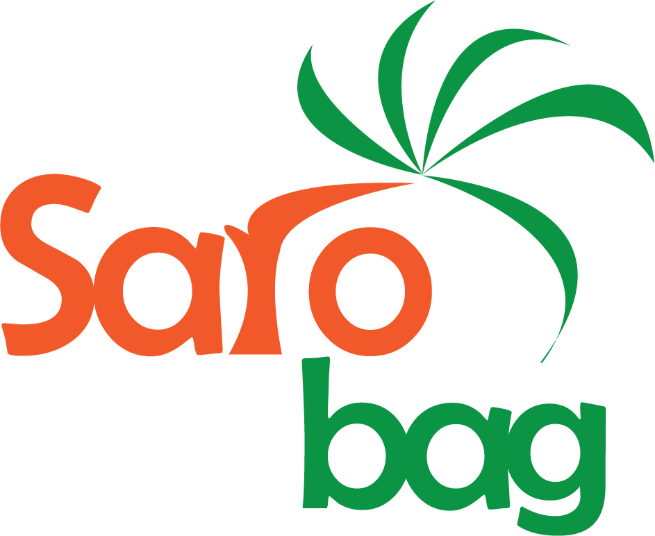
Sarobag, the abbreviated form of Sarong & Bag, is a beach product. Therefore the logo is designed with a beach theme in mind. The letter “R” in the word “Saro” is the distinctive feature in this logo, made to resemble a palm tree swaying in the wind. Palm trees are closely associated with beaches, so when people see the logo they will subconsciously make the connection to beaches.
The pantone colour combination was also carefully chosen, using light and fresh colors to make it look young and funky. The orange is to help the logo stand out, while the eco-friendly green compliments it as well as giving color to the “leaves”. This colour combination is very pleasing to the eye. The font used is Berlin Sans, to add a fun touch to the logo. See some other tips from our designers below….
Customised logo design should follow a few basic guidelines. ODM product designers suggest you can make or break your logo by following some of these rules.
ODM helps inventors in all aspects of development including logo & website design.
When two famous brands team up, it's not just a partnership, it's a powerhouse of… Read More
Narrowing down the selection of products that you offer at your gift store can get… Read More
End cap displays are strategic marketing fixtures essential for retail environments, positioned at the end… Read More