When people see your brand, before they read your name or understand the logo, they first take in the colour. To a sizeable amount of consumers, the colours affect their decision of purchasing or preferring one brand over another. With that in mind, we’re going over what is colour branding and how you can find the colours for your business. Let’s get this started!

Most of our big brand clients will order promotional products in clearly defined colours using a Pantone Color Chart. Our factories and QC staff all carry books of these colour codes for checking logo, product and packaging colours before shipment.
Colour symbolism and colour psychology are culturally constructed linkages that vary with time, place and culture. Humans react differently to each colour, therefore choosing the correct one for your product is extremely important.
What is Colour Branding?
When people hear certain brand names, the colour and logo immediately get recalled. The same is true when people see certain colours and immediately think of the brands. They hear green and think “Starbucks,” see red and recall “Coca-Cola,” or find a yellow arching fries and crave “McDonald’s.” This association deeply forged in people’s minds is colour branding.
This aspect of branding relies on the psychology of colour and the application of colour theory.
Firstly, colour psychology refers to how colours stimulate and affect people’s behaviour and mood. Blue can either bring a calm or bleak mood, red ignites passion and action but also rage, and yellow inspires laughs and movements but is also the least favourite colour in the world.

On the other hand, colour theory is the practical guide for the application of these colours in order to help communicate certain messages and emotions. Like what colour combinations works well together and how to mix them.
What To Consider In Selecting Your Brand Colour?
Choosing your brand colour out of the thousands of identified colours can be more than daunting. However, there are three things you should always keep in mind in order to select a colour fit for your business. We listed them here for you!
What Your Brand’s Colour Scheme Should Include?
1. Base Colour
The base colour of your branding should reflect your brand’s most important attribute strongly. This base colour will not just be your main colour but will also determine the other colours you will have to include in your colour scheme. This is also the colour that consumers will be most familiar with.
2. Accents
Accent colours are the most difficult to choose and will be most used after your base colour. These colours must compliment your base colour, represent your brand’s attributes and appeal to your target market all at the same time.
There are three main ways to get you accent colours based on colour theory. These are monochromatic, analogous and complementary. Monochromatic scheme refers to the shades of a colour which is usually your base colour. This is best used when you want your base colour and its attribute to be further highlighted.
On the other hand, an analogous scheme is the use of colours next to your base colour in the colour wheel. This is a safe choice since most colours next to each other evoke similar moods. Lastly, the complementary scheme refers to colours directly opposite in the colour wheel. These are complementary to each other and usually enhance how each other look when placed side by side.
3. Background Colour
Also referred to as neutral colour, your background colour typically must not attract attention in order to guide consumers’ eyes to your base and accent colours. This is usually white or grey, but will still largely depend on your brand and your target market.
Primary Used Colours and What They Mean with Examples
This colour represents purity, sterility and youth. White is often associated with cleanliness or innocence. Also, it is associated with neutrality and peace.
Therefore, this is very likely to see in pharmacies and hospitals. It gives a positive feeling and comfort of hygiene.


Red strikes a chord with more cultures than many other colours because of its intensity. It represents passion and invocation of an inherent physiological response.
The colour is bold and audacious, so it usually dilutes the colours around it. It is the reason red is used to accent and highlight objects of importance.
Studies show that red can have a physical effect. It includes the increasing rate of respiration, raising blood pressure and thus, making the heart beat faster.
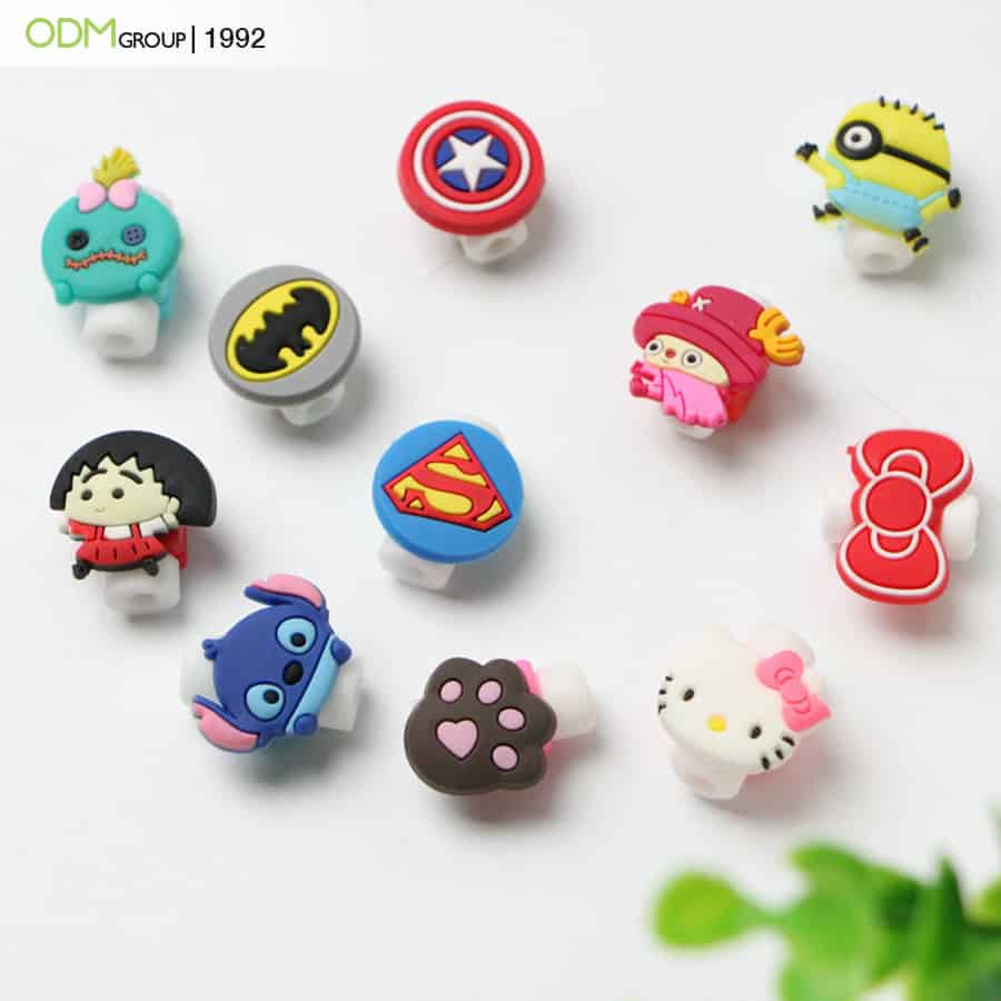
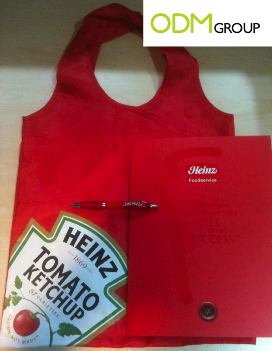
The red colour also increases the sense of hunger, so it’s used by many popular food and beverage companies, such as McDonald’s, Burgerville, Coca-Cola and corner cafés.
Green naturally says ‘nature,’ which explains why it is such a powerful symbol in the eco-friendly movement. Also, as ‘initiative’ and ‘wealth.'” It is a colour that soothes the eyes and produces a calming effect when it’s seen.
This is likely due to its association with the greenery of nature. For companies providing a pampered escape, green is a colour that will signify rejuvenation and energy for your brand like the coffee house, Starbucks.
Green symbolizes great intelligence, nature, spring, fertility, youth, environment, money (US), good luck (Ireland), vigour, generosity, grass, life eternal, earth (classical element), sincerity, harmony, stability, creative intelligence, and Islam.


Orange means energy, enthusiasm, a ‘get-it-done’ attitude, and balance. It typically symbolizes Hinduism and Buddhism.
Also, happiness, energy, balance, heat, fire, enthusiasm, flamboyance, playfulness, aggression, arrogance, gaudiness, over-emotion, warning, danger, autumn, desire, Sagittarius (star sign) and September as a colour of autumn.
A famous brand that uses orange as its base colour is the MasterCard, with red and teal as its accent colour.
Yellow echoes the dual nature of red although yellow evokes feelings of happiness more.
It typically symbolizes sunlight, joy, happiness, earth, optimism, intelligence, idealism, wealth (gold), summer, hope, air, liberalism, femininity, gladness, sociability, friendship, and courage (Japan).
Echoing the liveliness and friendship that yellow evokes, it is used by social media and messaging app, Snapchat, wherein people come to form and sustain relationships like friendship.


The best colour to wear for an interview is blue. Blue is non-threatening, yet confident and stable. Many police uniforms are blue because the colour says confidence and security while being non-threatening. With the good, however, there’s the bad. Blue can also signify depression. The “You’ve got the blues” line is a nod to this attribute.

However, this colour itself symbolizes heaven, God, something unreachable, and calming. Blue can also symbolize seas, men, productivity, interior, peace, unity, harmony, tranquillity, calmness, trust, coolness, confidence, conservatism, water, ice, loyalty, dependability, cleanliness, technology, winter, idealism, air, wisdom, royalty, nobility, Earth (planet), Virgo (light blue), Pisces (pale blue) and Aquarius (dark blue, star sign), strength, steadfastness, light, friendliness, peace, love.
More colour related reads for you:
Now that you have decided on your brand colour scheme, you must then ensure these will be consistent in all your promotions! Especially branded merchandise that consumers will use regularly. Head on to the blog below!
Get more in-depth knowledge about brand colour printing in your promotional products through one of our factory visits! We featured it in the blog here:
Branding your promotional items is a must in order to build a brand presence in your market’s daily lives. This is where your decorative method options will come in handy.
Colour Branding FAQs
All you need to know about how to associate colours with your brand!
What can color bring to branding?
Colours invoke certain emotions and entice consumers to certain actions, as well as communicate certain things. By knowing what your brand aims to invoke to your consumers, you can decide on your brand colour and let them communicate to your consumers with just a glance.
Does colour increase brand recognition?
Yes, it can increase brand recognition. According to research, you can see an 80% increase in brand recognition if you will use a consistent colour for branding.
What is colour psychology?
Colour psychology is the study of how colours can affect human behaviour and mood.
How does colour affect consumer behavior?
The colour can affect consumers' behaviour through the emotions they associate with the colour. For example, a blue and white colour combination makes people calm. When a security company uses these colours, people will perceive that as a calm and collected image. Ultimately, trusting the brand.
To Sum It All Up,
The colour that you choose to promote your brand is vital because of its image that affects people. After all, people are your target. It must be your priority to stimulate and motivate them to purchase or avail of your promotions and services. Your brand colour is a powerful tool at your arsenal you simply has to learn to utilise it to your advantage.
How ODM Can Help?
Our team includes very creative and open-minded product designers. They can provide you with multiple unique and interesting ideas. Our design experts, Mindsparkz, are capable of assisting you throughout every process to ensure a pleasant experience. Don’t hesitate to contact us!
The ODM Group is a promotional product development company that specialises in the customisation of promotional items. We’re dedicated to ensuring quality work that meets the standard of your marketing needs.
ODM also has a magazine consisting of 8000+ articles about the industry processes and promotional merchandise ideas to inspire you!
What To Read Next?
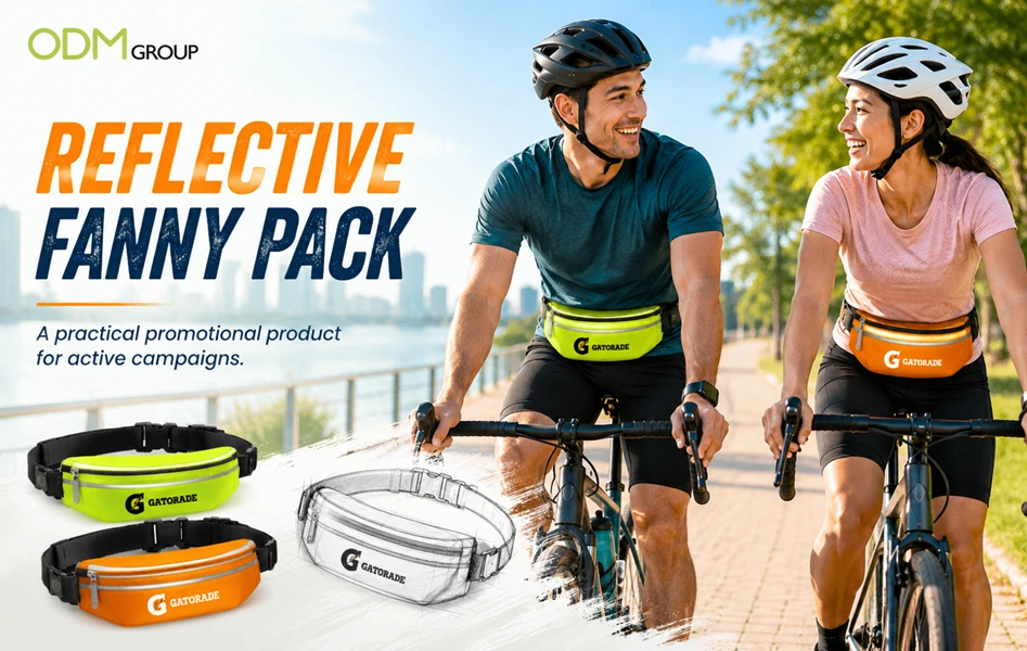
Reflective Fanny Pack: A Practical Promo Item for Active Campaign
A reflective fanny pack gives brands a useful way to connect with active, mobile consumers. [...]
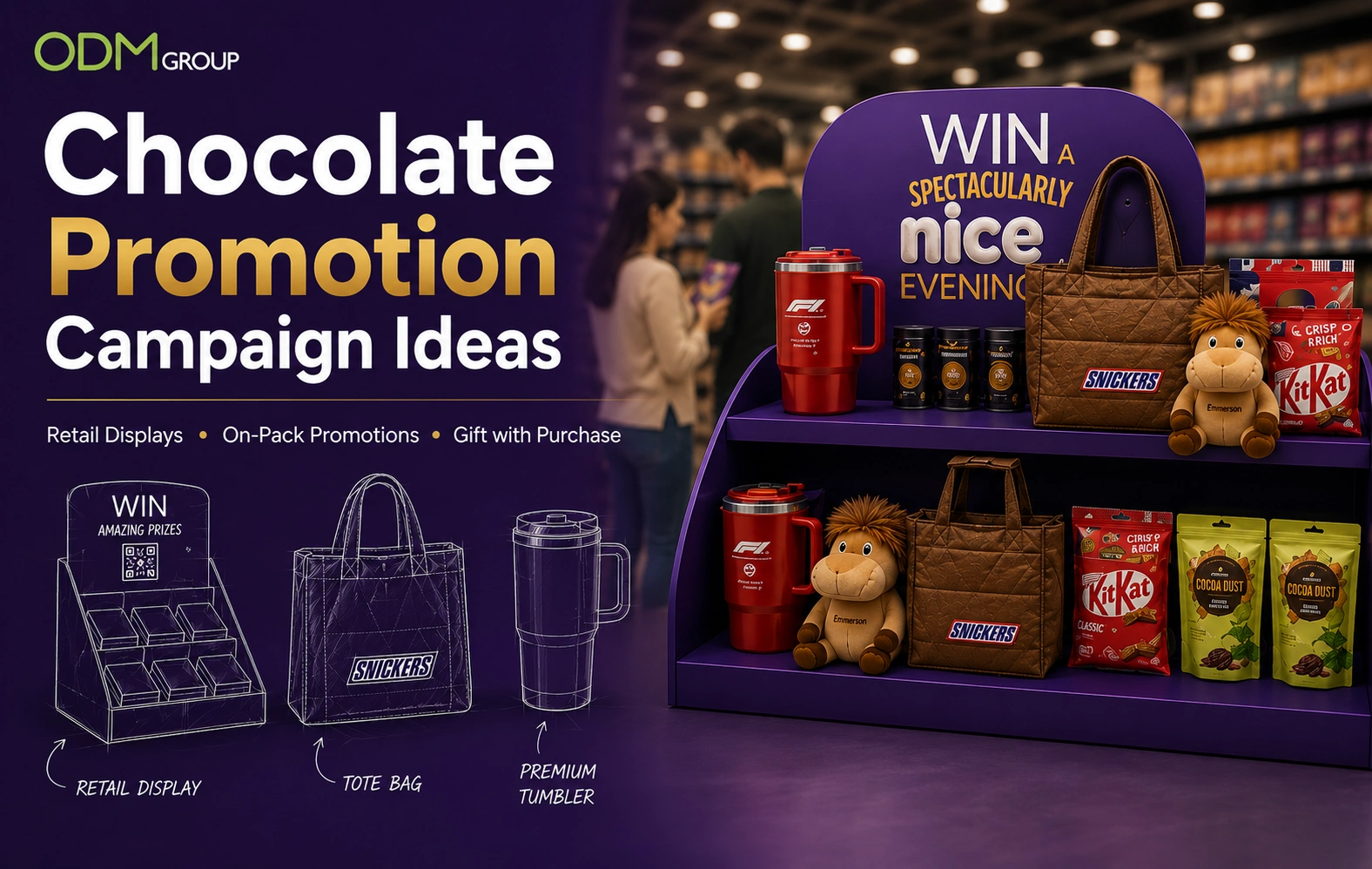
Winning Chocolate Promotion Ideas Inspired by Global Brands
A well-planned chocolate promotion can increase product visibility, encourage customer engagement, and drive retail [...]
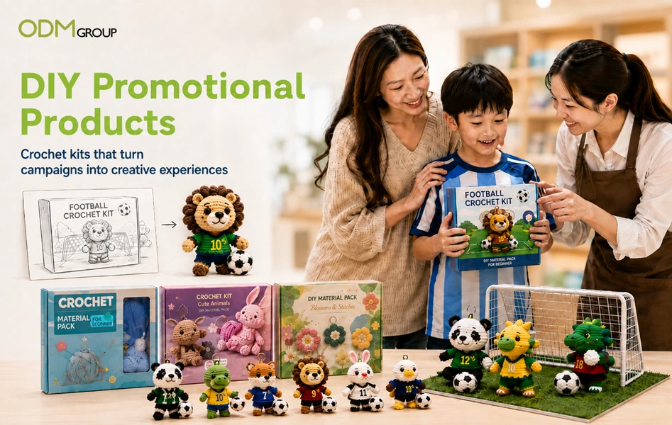
DIY Promotional Products: Crochet Kits for Interactive Campaigns
Promotional gifts become more memorable when customers participate in the experience. Instead of handing [...]
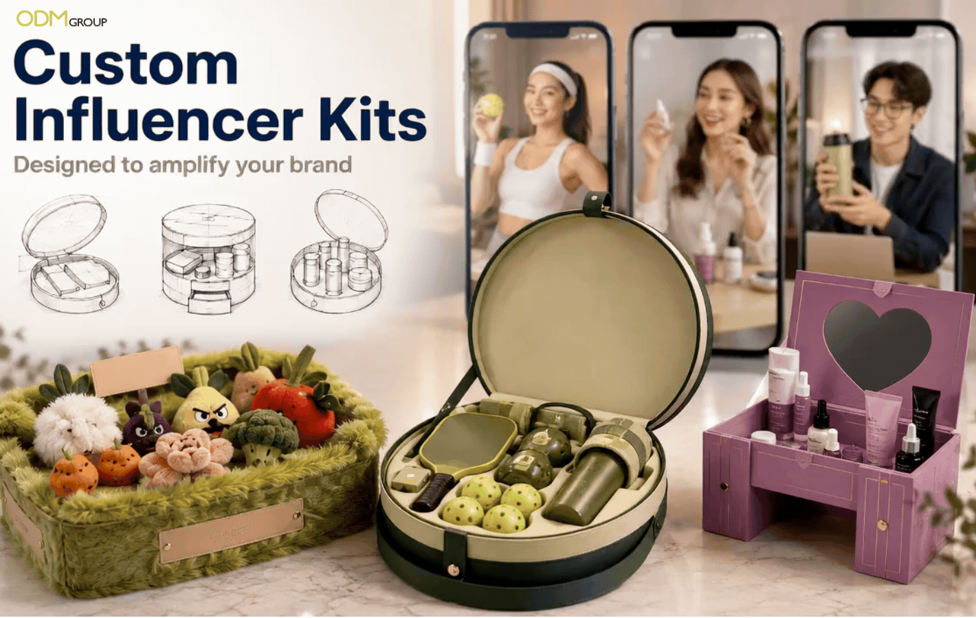
Creative Custom Influencer Kits for Stronger Brand Impact
Custom influencer kits give brands a physical way to introduce products, communicate campaign stories, [...]
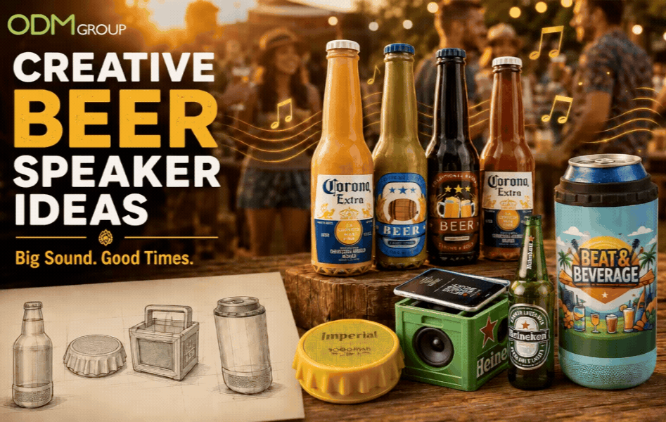
Beer Promo Ideas: Amplify your Marketing with Custom Speaker in a Can!
Beer Products, Beer promotions, Speaker Manufacturer, Beer GWP campaigns, Gift ideas for beer promotions.