We recently tasked to manufacture reusable bottles and a POS Display for a client. The client wanted the shade of the sign to be similar to the shade of the product. However, there were some minor difficulties in finding the correct shade for brand colour printing.
At ODM, we strive to create high-quality custom promotional products for companies across the world. We make sure that the result of the products is flawless as we do not want to fail our clients. Therefore, this is a problem we need to resolve.
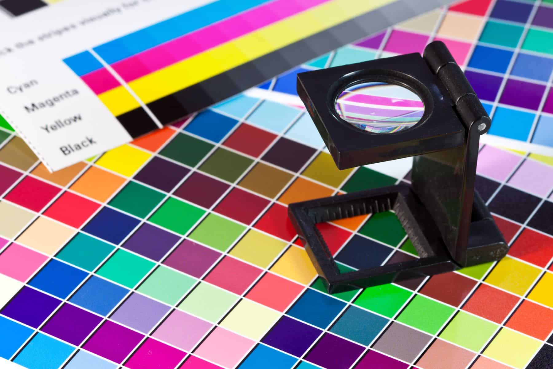
This was how we find the correct shade for brand colour printing to match a product. We usually use a pantone book and give a number to our printers for checking colours, but in this case the printer in Vietnam was not able to match so we had to do a trial print and choose the best result.
Initial Problem with Brand Colour Printing
We received 2 samples from the printing supplier but the shade of blue is way off from what the team and client wanted. Additionally, they also gave us a colour chart of different shades of blue. The number of shades were limited and is way off from the shade we wanted. This affected our manufacturing process and could delay the time it gets to our client.
We were disappointed with what the supplier delivered and decided to call the printing company and went to the store personally.
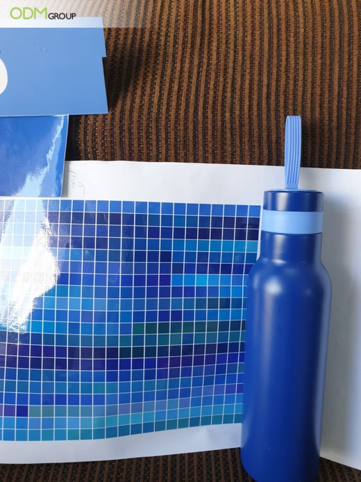
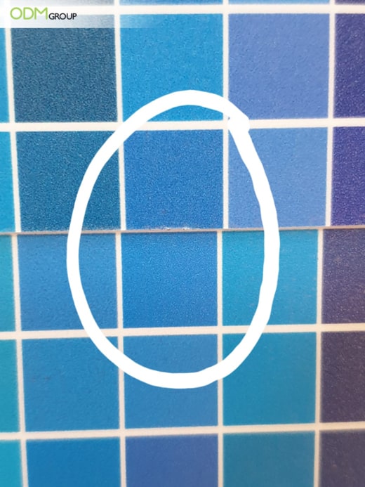
Brand Colour Printing – As shown above, the shade of blue of two samples the supplier gave was different from the shade of the product (water bottle).
Going to the Printing Store
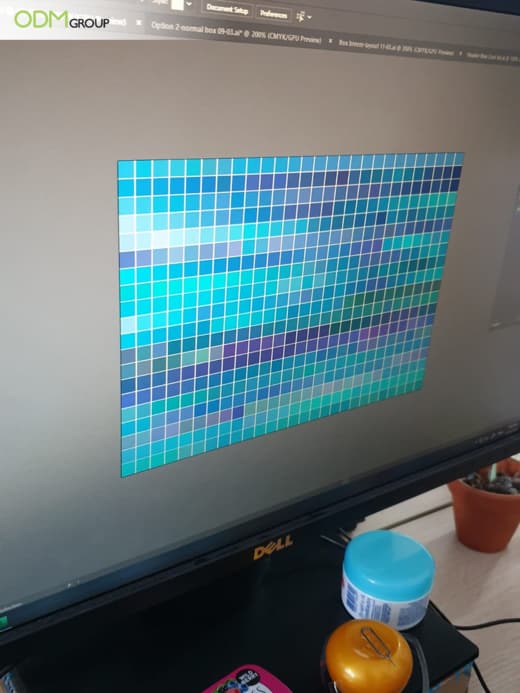
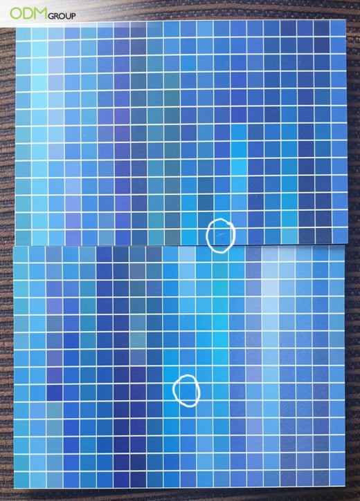
1. Firstly, we emailed the printing company our own colour chart of 520 different shades of blue for them to print out when we visit the store which was in the Ho Chi Minh City, Vietnam.
Brand Colour Printing- This was the colour chart sent to the supplier.
2. When we arrived at the store, they had printed it out on a glossy paper. However, we requested them to reprint the colour chart on cardboard which the brand name will be printed on. Cardboard has a matte finish and colour and shades appear different than it is on a glossy paper.
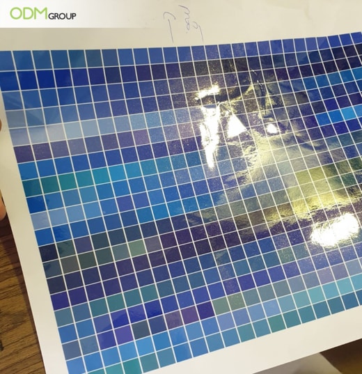
Brand Colour Printing- Colour Chart on a Glossy Surface
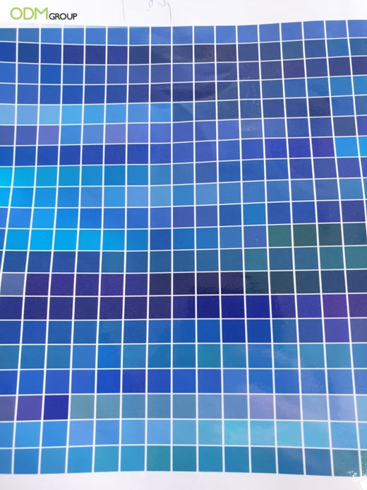
Brand Colour Printing- Colour Chart on a Matte Surface
3. After getting the colour chart printed out, we went on to find the correct colour. We also requested them to cut the cardboard in half to quicken the process. We looked at each shade and thoroughly compared it to the colour of the referenced product.
4. Eventually, we came down to two shades and requested the supplier to print out the sign of the brand in these 2 shades for final selection.
Brand Colour Printing
Brand Colour Printing- The final 2 shades we came down to.
Challenges Faced with Brand Colour Printing:
-
Colour appears different on different kinds of paper and surfaces.
The supplier initially printed the colour chart on a glossy paper; however, it will appear different on a matte surface. In addition, the product that we are referencing to, comes in a shiny packaging.
-
Interference of Light
Light can hinder the process of finding the correct shade. It can make a shade darker or lighter than it actually is. Furthermore, as the packaging of the product is shiny, it made the process a little more challenging. We tried to go to a location where there is not much sunlight.
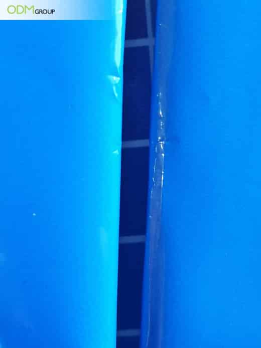
Brand Colour Printing- These are two similar products. However, the shades look different as the packaging is shiny and the light made them appear different.
-
Long Process
It took quite a long time to find the correct shade as there are 520 shades we have to compare with. We speed up this process by splitting the job and cut the colour chart in half. We also utilise the process of elimination and eliminate colours that we know that do not match. Furthermore, the long waiting times for them to print the samples lengthened the process.
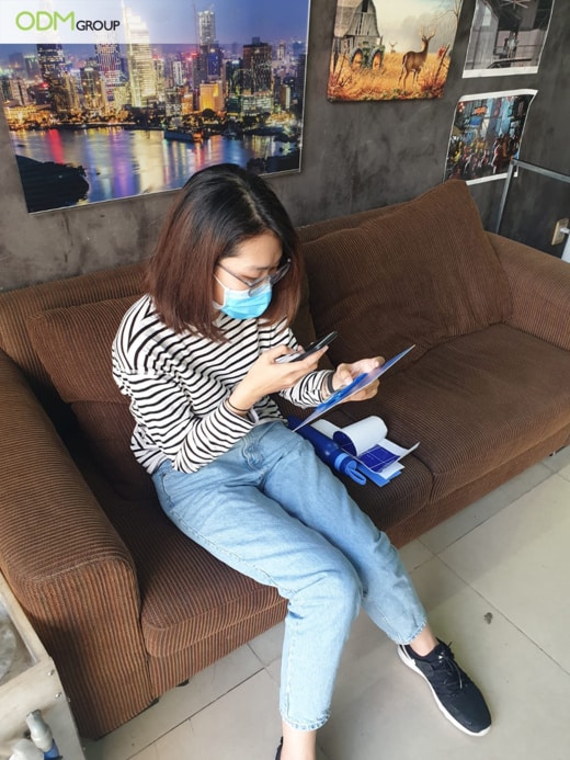
Brand Colour Printing- Sitting at an area where there are little sunlight interference. We also used our phone cameras to look closer at the shades.
Advice on Colour Printing
-
Establish Good Relationships with Supplier
By having a good relationship with the supplier, they would be able to deliver what we requested them. There would be little to no issues faced with them. In addition, they would prioritise our needs and get the task done quickly.
-
Good Communication
You should give clear and detailed information to the supplier about the needs. In addition, the supplier should give regular updates to clarify with the client whether their needs are met. By having a two-way communication, problems can be avoided.
-
Research and Evaluation
By doing thorough research and evaluation, you can find the best supplier that will be able to get the job done cost-effectively, quickly and flawlessly. You can take a look at reviews online or call them directly.
Conclusion
Overall, we hope we would not face a problem with brand colour printing again with our supplier. The ODM team is very meticulous with every aspect of manufacturing promotional products, in order to satisfy our clients and ensure that their needs are fulfilled.
Take a look at these blogs, they are worth reading:
Learn more about colour branding, what they can add to your brand and what to consider in selecting your brand colours in the blog below:
Want to know more about POS Displays? Take a look at this blog!
https://www.theodmgroup.com/pos-display/
Read this blog post to learn more about printing methods!
Interested in POS Displays? We think this POS design by Nivea is very innovative with mixed marketing materials.
Curious to why toothpaste companies offer colourful in-pack promotional gifts? Take a look at this blog to find out why!
We think that this creative POS Display will be a great idea to promote your cosmetics. and attract sales:
This floor display by Atelier Cologne is worth taking a look at!
Related posts:
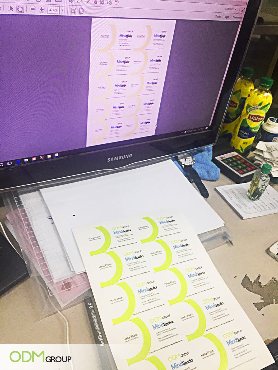 Vietnam Printing Supplier – Business Card Printing
 Unleash Your Brand: 7 Key Benefits of Full Colour Printing!
 What is Colour Matching Process in Printing Promotional Products?
 Custom Makeup Display by Max Factor Promotes Brand Interaction
 Colour Changing Stress Balls Promo Gifts That Keep Your Brand in Hand