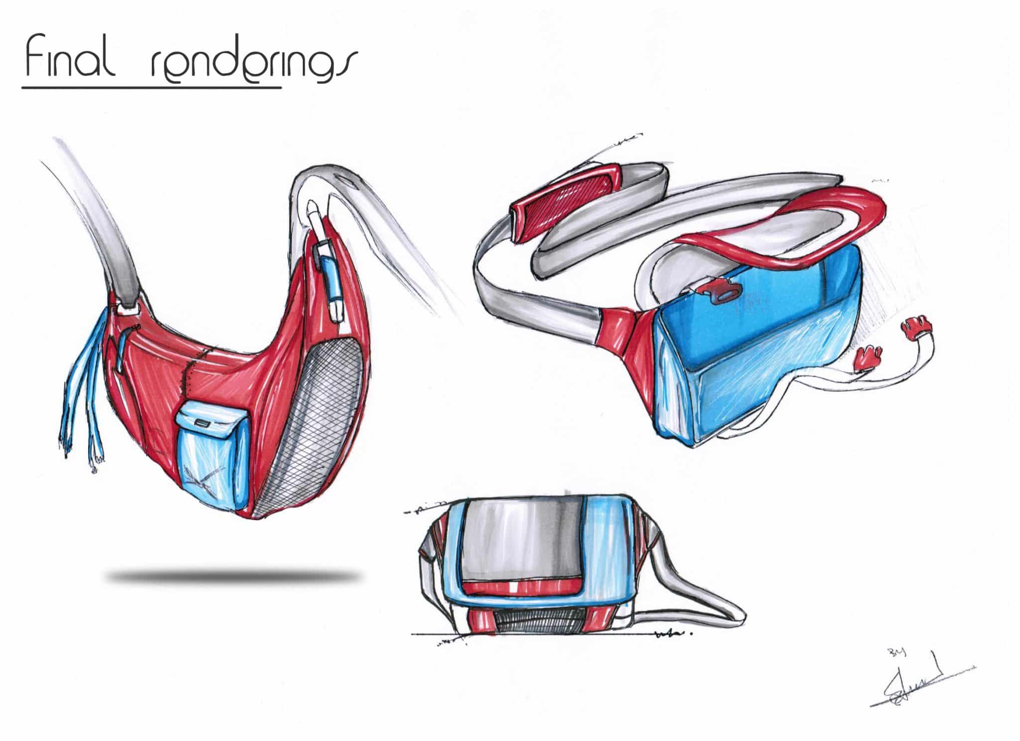
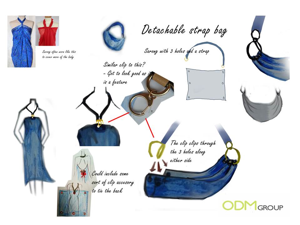
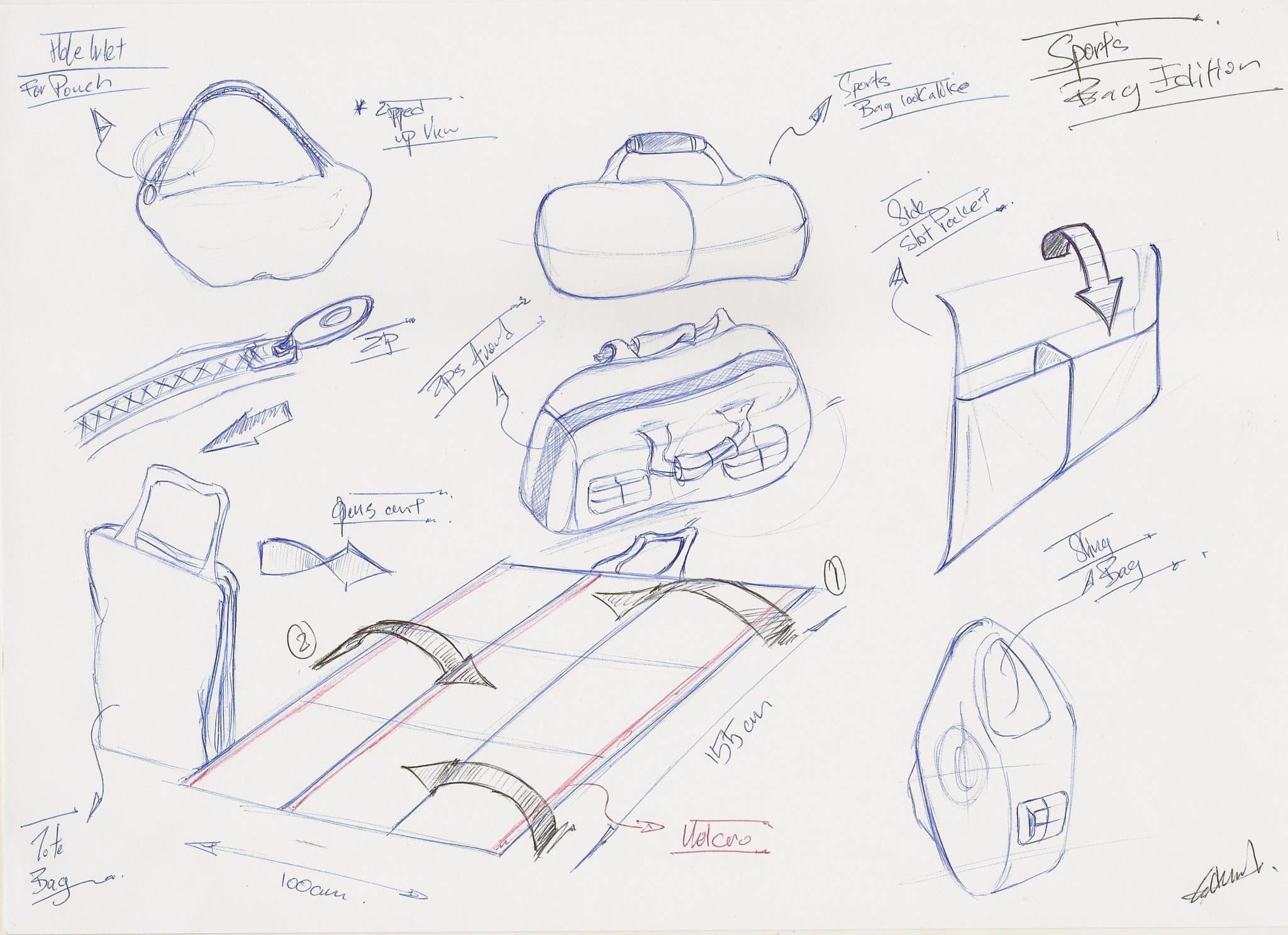
Moving along with development of the Sarobag, we wanted to get a marketing storyboard ready for our clients in order to showcase our idea and the brand we are developing. With other designers working on the general bag styling and construction, our graphic artist started on the logo design.
Sarobag, the abbreviated form of Sarong & Bag, is a beach product. Therefore the logo is designed with a beach theme in mind. The letter “R” in the word “Saro” is the distinctive feature in this logo, made to resemble a palm tree swaying in the wind. Palm trees are closely associated with beaches, so when people see the logo they will subconsciously make the connection to beaches.
The pantone colour combination was also carefully chosen, using light and fresh colors to make it look young and funky. The orange is to help the logo stand out, while the eco-friendly green compliments it as well as giving color to the “leaves”. This colour combination is very pleasing to the eye. The font used is Berlin Sans, to add a fun touch to the logo. See some other tips from our designers below….
![]()
![]()
Customised logo design should follow a few basic guidelines. ODM product designers suggest you can make or break your logo by following some of these rules.
- A logo has to be simple and scalable, but still pack a punch. Picture this – you have a really complex and messy looking logo which actually looks really impressive, but what happens when you scale it down to maybe an inch in size, can people still tell what it is?
- Typography or font used in the logo must be legible. If people cannot read what is on your logo, then what is the point of having a logo?
- The logo must be compatible with the image you want to portray. For example, you wouldn’t design a logo for a law firm filled with flowers and fun fonts, would you?
- It has to be unique and recognizable. If your logo is unique and recognizable, it helps people to remember it.
- Good choice of colors that make viewing pleasurable. Your logo’s colors should contrast against white, as it is one of the more commonly used backgrounds. Use complimentary colors for it, so that it is easy to look at. Consider how it will look in monochrome as well, because there will be situations when the logo cannot be printed in color, such as in receipts.
ODM helps inventors in all aspects of development including logo & website design.