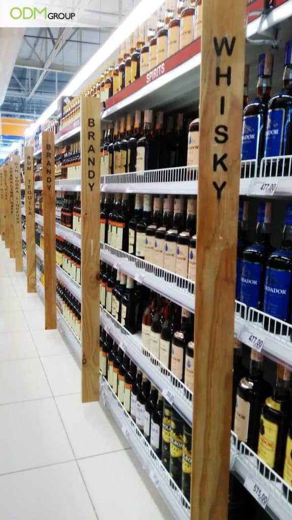
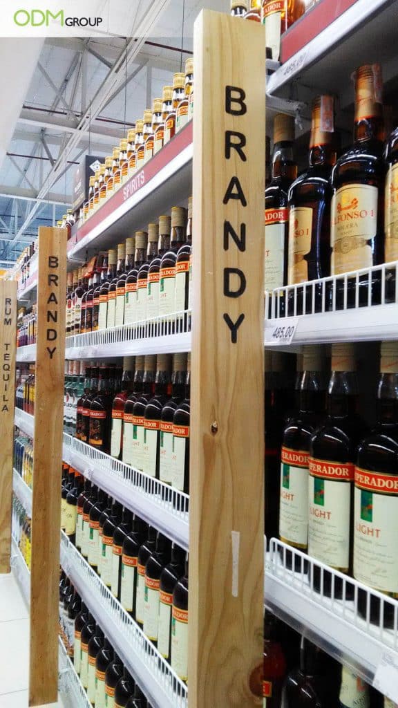
We’ve spotted these beautiful wooden shelf talkers at the “Wines and Spirits” section of grocery store in the Philippines. The visual impact of their shelf talker design had us in awe. They are made out of wood with types of alcoholic drinks such as “Whisky” “Brandy” “Rum” and “Tequila” branded on them.
Shelf Talker Design
We love the simplicity and the modern yet earthy ambiance the custom shelf talkers created. Unlike other shelf talkers, there was not much vibrant colors and and graphics, but they were able to command attention nonetheless.
Indeed, these are truly a great example of effective branding and visual merchandising. But how about your brand? Is it time to update your shelf talker design?
As business owners, you want to make sure that you’re getting the most of your POP and POS displays. So here are signs you need that much needed shelf taker design update.
3 Signs You Need to Update Your Shelf Talker Design
Customers Have to Come Closer to Your Display to Read What’s Written: As mentioned in our previous blog, the right font can help to convey your brand message. According to studies fonts can have different impact on buyers’ perception of your brand. Using Comic Sans may make your brand look unprofessional or amateurish. While Arial and Times New Roman are more preferred because of its clean and simple look.
If you take a look at our example, you’ll see that the typography is simple and easy to read even from a distance.
Shelf Talker Design
Your Display Looks Messy and Disorganized: In an effort to make their brands stand out, many marketing managers make the mistake of using too many vibrant colors and words on their shelf banners or shelf talkers. Less is still more when it comes to designing a signage. Shoppers are too busy to read long winding texts, so keep your shelf talkers simple and your message succinct and to the point.
Information overload can driver your customers away. But, short and informative messages can be more powerful in convincing buyers to pay attention to your display. Here’s a good example by Ariel:
The kept the design simple by sticking to their main brand colors : white and green and a few words to describe their product.
The Design Does Not Fit The Brand Image: When designing a promotional shelf talker, you have to consider the kind of product you are selling and if it will help bring the best out of your products. Does the color and style add value to your in-store display? Do the materials suit the image you want to paint?
In our example, one can sense that this aisle is targeted towards the older shoppers. Wood is an excellent choice of material because it looks classy and is sturdy. Also it lends a vintage look which is a common theme in most wine packaging and visual merchandising. As wine and most alcoholic drinks are aged in wooden barrels, the use of wood also makes an interesting connection.
Interested in Creating a Shelf Talker Design That Drives Sales?
If so, contact us! The ODM Group specializes in merchandising and manufacturing of unique promotional products, compelling POS display units, and innovative brand packaging design. We work closely with our design team, Mindsparkz, to ensure that your promotional items meet your design and business needs.
Need more shelf talker design ideas? Check out these blogs:
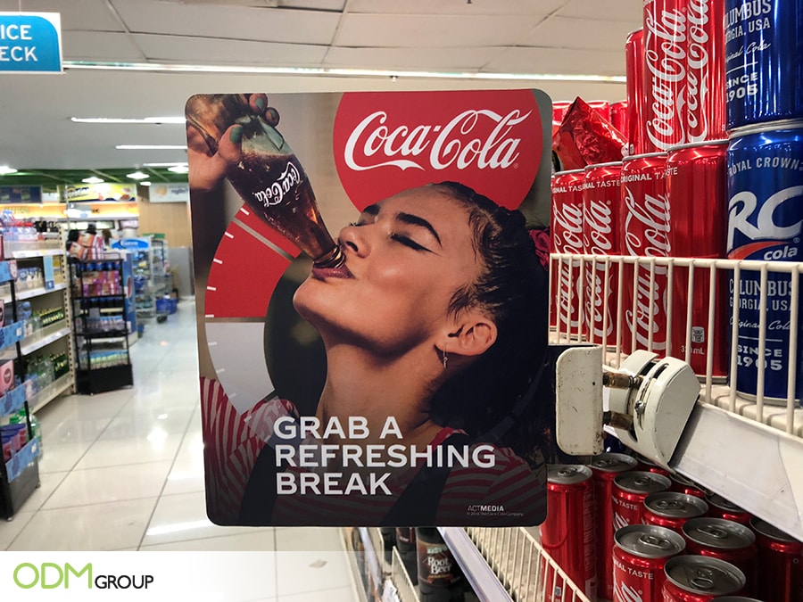
Coke keeps their shelf talker simple and targeted towards the youth. The color and graphics match their brand message well:
We love the puchy line in this shelf talker “You brush, they chomp.” It’s simple, easy to set up and the graphics get their message across effectively.
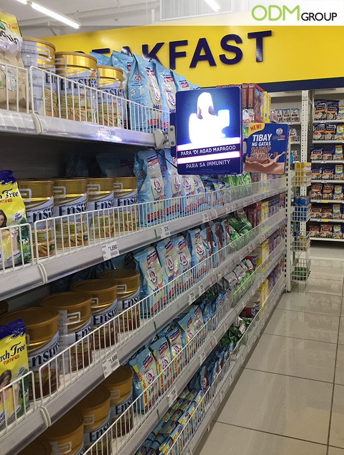
One of the best shelf talkers we’ve seen thus far. The LED light highlighted their new product on offer. It’s attractive and the message is clear.
What should I avoid in my shelf talker design?
Too little font size, customers can’t read the message Your Display Looks Messy and Disorganized The Design Does Not Fit The Brand Image
What the most visual appealing material for shelf talkers?
Wood is an excellent choice of material because it looks classy and is sturdy. Also it lends a vintage look which is a common theme in most wine packaging and visual merchandising. As wine and most alcoholic drinks are aged in wooden barrels, the use of wood also makes an interesting connection.
Related posts:
 Customized Shelf Talker: Why It is Your Best In-store Marketing Tool
 Coke Promotes Their Brand With Cool Shelf Talker Ideas
 Highlight Your On-Shelf Marketing with Shelf Talkers
 Less Talk, More Sales: 4 Benefits of Shelf Talker Display in Marketing
 4 Signs Your Business Needs to Update Your Custom Store Display